Redesigning Legacy Enterprise Software
Modernizing Bosch's internal project management system for thousands of global users
📅 2022 • 6 monthsMy Role
UX Design Intern
Team
CI/XUX Department
Core Activities
User research, information architecture, prototyping, usability testing
Tools
Axure RP, Miro, Adobe Illustrator
One of Bosch's internal project management system built on Oracle Forms needed migration to modern web architecture. My task was redesigning multiple admin screens while maintaining functionality for a global user base and working within significant technical constraints.
My Role
As UX Design Intern in a 3-person team, I was responsible for:
- Conducting user research and stakeholder interviews
- Creating information architectures for complex admin interfaces
- Developing high-fidelity prototypes in Axure
- Running iterative usability tests using RITE methodology
- Collaborating with international UX designers and developers
Understanding the Problem
Outdated Technology
Oracle Forms platform was visually dated, difficult to maintain, and inconsistent with modern web standards
User Frustration
Small, cluttered interfaces with unclear information hierarchy made daily tasks inefficient
Technical Constraints
Legacy architecture limited design possibilities, requiring creative problem-solving within boundaries
Organizational Scale
Changes would affect thousands of users across different departments and workflows globally
"The system works, but it's painful to use. I need to click through multiple screens just to find basic information."
Bosch Project Manager, user interview
Understanding Users and Constraints
I conducted stakeholder interviews with product owners and developers, user interviews with Bosch employees, and analyzed the existing system to understand both user needs and technical limitations.
I conducted stakeholder interviews with product owners and developers, user interviews with Bosch employees, and analyzed the existing system to understand both user needs and technical limitations. I engaged with product owners and development teams to capture business requirements and constraints, and spoke with internal employees using the tools daily to identify pain points and workflows. Through system analysis, I mapped technical architecture and constraints to determine the feasibility of design solutions. Finally, I performed competitive analysis by reviewing other Bosch web applications to identify established patterns and best practices.
Key Findings
- Information hierarchy was unclear—users struggled to locate needed data efficiently
- Inconsistent interaction patterns across modules created cognitive overhead
- Missing empty states left users confused when data was absent
- Poor visual feedback made system responses feel unresponsive
Design Principles
Based on research findings, I established design principles that balanced user needs with technical constraints while aligning with Bosch's Digital Design System.
Consistency
Align with Bosch Digital Design System to create cohesive experience across all modules
Clarity
Improve information architecture and visual hierarchy to reduce cognitive load
Efficiency
Streamline workflows and reduce unnecessary steps in common tasks
Scalability
Create reusable component patterns to accelerate future development
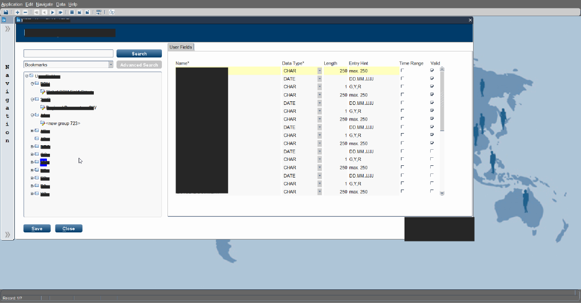
Administrative Interface for User defined Configuration
The Challenge
The legacy admin screen for managing user-defined fields suffered from confusing navigation between field groups. Users needed to configure custom fields across multiple projects, but the tree-based structure proved unintuitive and prone to errors.
Process
Initial Concepts
Brainstormed navigation patterns with team, exploring multiple structural approaches through sketches
Low-Fidelity Wireflows
Created paper prototypes to test different information architectures with stakeholders
Iteration
Tested folder-based structure inspired by familiar file explorers, validating with users
High-Fidelity Prototype
Built interactive prototype in Axure implementing new design system components
Validation
Conducted usability tests, gathered feedback, and refined interaction details
Solution
Folder-Based Navigation
Implemented intuitive grouping similar to file explorers users already understand
Synchronized Selection
Connected checkbox selection with detail view for immediate visual feedback
Clear Hierarchy
Established visual hierarchy through spacing, typography, and strategic use of color
Contextual Empty States
Designed helpful illustrations and messaging when no data exists
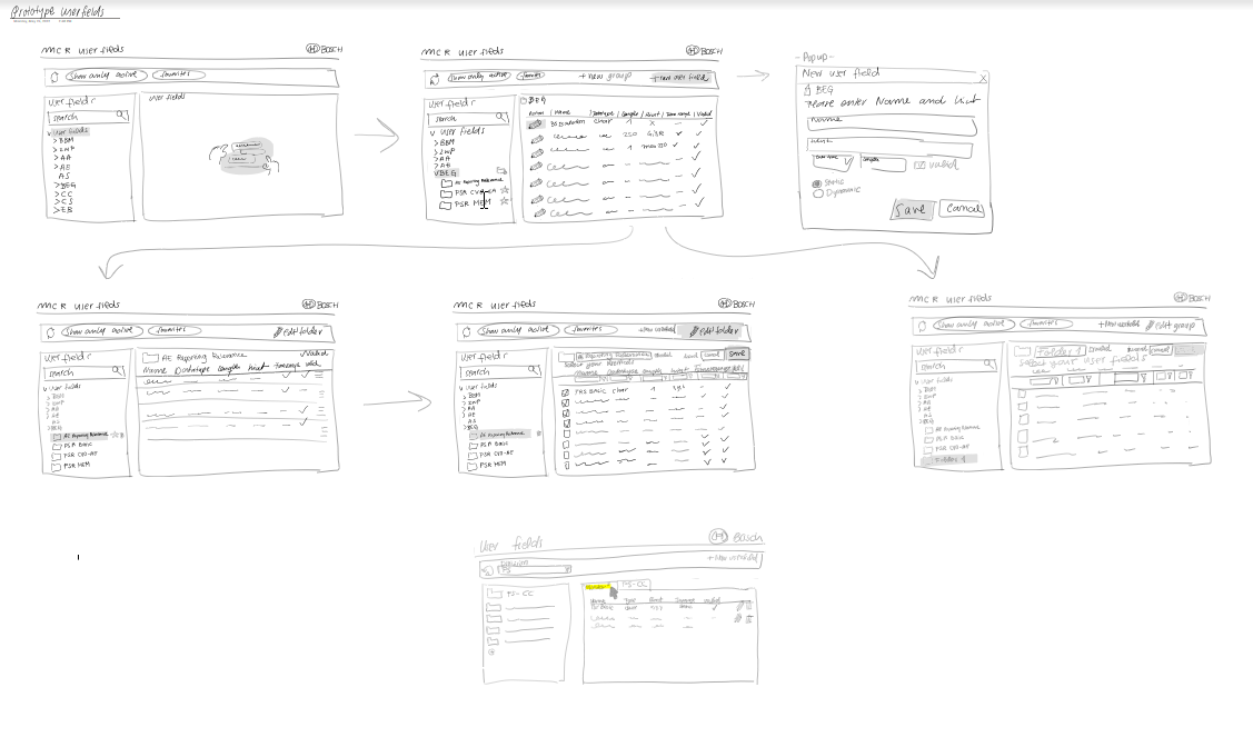
Before/During/After comparison: oracle system, first exemplary wireframe evolution, and final prototype screenshots.
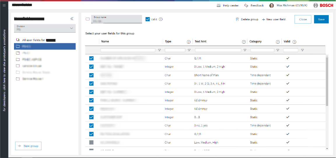
Further Data Management Screens
Beyond the user data management interface, I redesigned 10+ Data admin screens with varying complexity levels—from simple data tables to complex hierarchical structures.
Approach
I conducted analysis by categorizing screens according to complexity levels and usage patterns to prioritize work effectively. I developed a component strategy by identifying reusable design patterns to maintain consistency and efficiency across the product. In visual design, I created contextual empty states and illustrations tailored to each screen context. Throughout the process, I collaborated closely with the development team to ensure technical feasibility of all design solutions.
Outcomes
- Established consistent design language across all admin screens
- Improved data scannability through refined table design and spacing
- Created context-appropriate empty states with custom illustrations
- Reduced development time through systematic component reuse
Testing and Iteration
RITE Methodology
We used Rapid Iterative Testing and Evaluation—observing users, identifying issues immediately, making design adjustments, and testing again with the next participant. This approach compressed the feedback loop from weeks to days.
Observe
Watch users interact with prototypes
Identify
Spot usability issues in real-time
Adjust
Make design changes between sessions
Validate
Test changes with next participant
Key Iterations
- Replaced tree structure with folder view after observing consistent user confusion
- Adjusted table density based on feedback about information overload
- Simplified filter patterns when testing revealed original design was too complex
- Added contextual help for admin functions where users consistently requested clarification
Icons and Visual Language
Beyond management interfaces, I contributed to the visual language by creating custom iconography and empty state illustrations following Bosch brand guidelines.
Icon System
Designed custom icons for different modules, maintaining consistency with Bosch's visual language while improving clarity
Empty State Illustrations
Created contextual illustrations that made empty states more approachable and provided guidance on next steps
Dashboard Logo
Developed a logo concept for an internal dashboard tool through iterative feedback with stakeholders
Impact and Learning
What I Learned
During my internship, I gained valuable experience designing within the constraints of legacy systems. I learned to view limitations not as obstacles, but as opportunities for creative problem-solving that require systematic thinking and careful prioritization. Working closely with product owners and developers, I strengthened my ability to communicate design decisions clearly, handle feedback constructively, and find solutions that balance both user needs and business goals. Designing for complex enterprise software also taught me the importance of a structured approach: documenting information architecture, creating reusable components, and maintaining consistency across systems became essential parts of my workflow. Above all, I discovered the power of iterative design and testing; by testing early, learning quickly, and refining designs iteratively, I learned to embrace adaptability and responsiveness as central to creating impactful user experiences.
This internship showed me that meaningful UX work isn't about flashy interfaces. It's about understanding complex problems, working within real constraints, and making thoughtful decisions that improve people's daily work. Enterprise UX presents deeply interesting challenges with tangible impact.
Note: Due to confidentiality, some project details and visual assets have been anonymized or generalized. The design process and learnings remain authentic.
Interested in discussing this project or my other work?